Overview
This was the second project in my introduction to website design, instead of redesigning, we were tasked with making a website of our own. In this exercise, we had to create a restaurant with the rules being that we needed a menu page and 2 other pages of our choosing. I decided to create a ramen shop with inspiration from other ramen restaurants in the downtown Austin and Abilene area.
DISCLAIMER: For the logo, I used Adobe’s Gen-AI FireFly.
Stage 1 - Ideation
At this stage, I needed to flesh out our restaurant idea. I first started by getting inspiration from other ramen shops in the Austin and Abilene area. I took note of what menu fragments they used as well as the layout of their website. I noticed that most of them had an “About Us” page where they could share their story with their customers. Another part of this stage was making a task list for the potential people who would visit the website.
Task List
A user wants to view the menu
A user wants to view pictures of the food available.
A user wants to read about the story of the restaurant and its owners
A user wants to check out events/holidays the restaurant is doing something for.
A user wants to order something through the online order system
A user wants to customize the ramen they are ordering
A user wants to look for dietary specials on the menu
A user wants to navigate to customer reviews and testimonials
A user wants to find reviews on specific ramen bowls.
A user wants to find other locations
A user wants to find the hours of those locations
A user wants to make a reservation
A user wants to call Ramen Radiance
A user wants to look for Ramen Radiance's social media handles
A user wants to look for Frequently asked questions.
A user wants to leave a review
A user wants to purchase a gift card
A user wants to purchase other merchandise
A user wants to navigate to the store.
A user wants to look at Ramen Radiance’s community involvement.
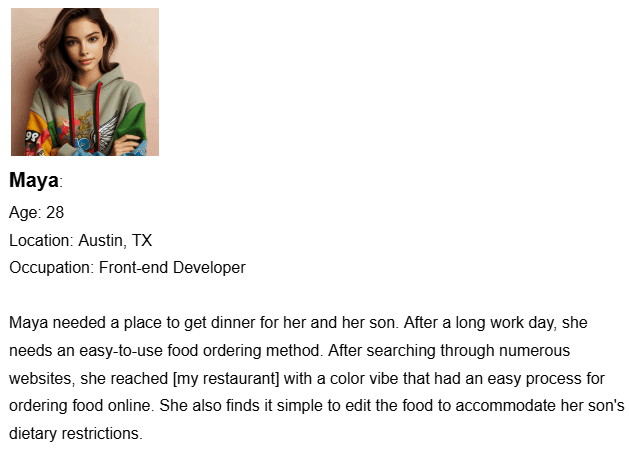
After creating a task list, I used those tasks to make user personas of who specifically I was making this website for. Now, trying to pinpoint a restaurant's exact customer archetype is nigh on impossible. But here I tried to think of 2 people who would possibly live in a downtown area.
DISCLAIMER: For the photo of the persona, I used UI Faces.

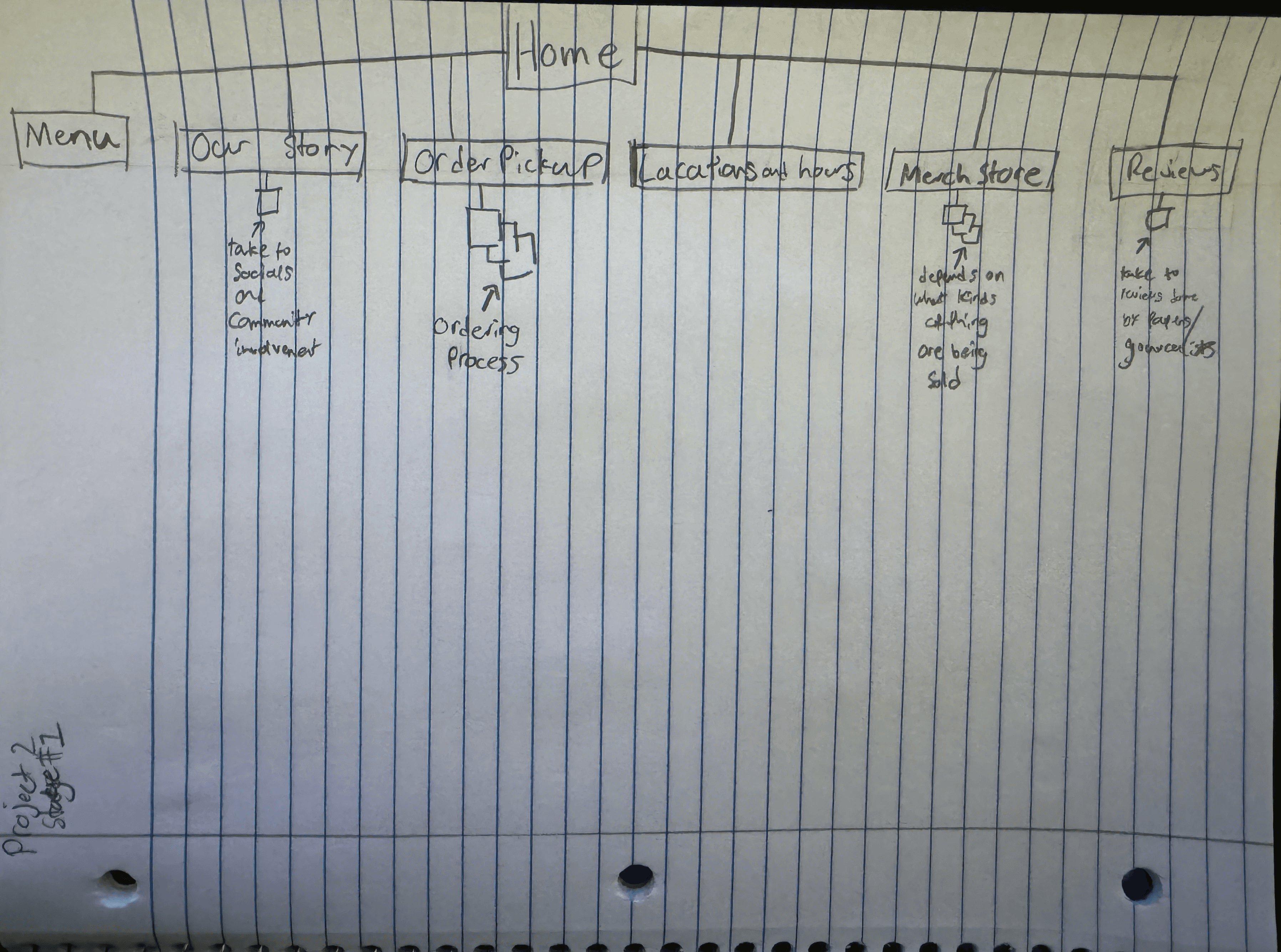
In addition to all of that, I created a site map to get a general layout of how this website would navigate.
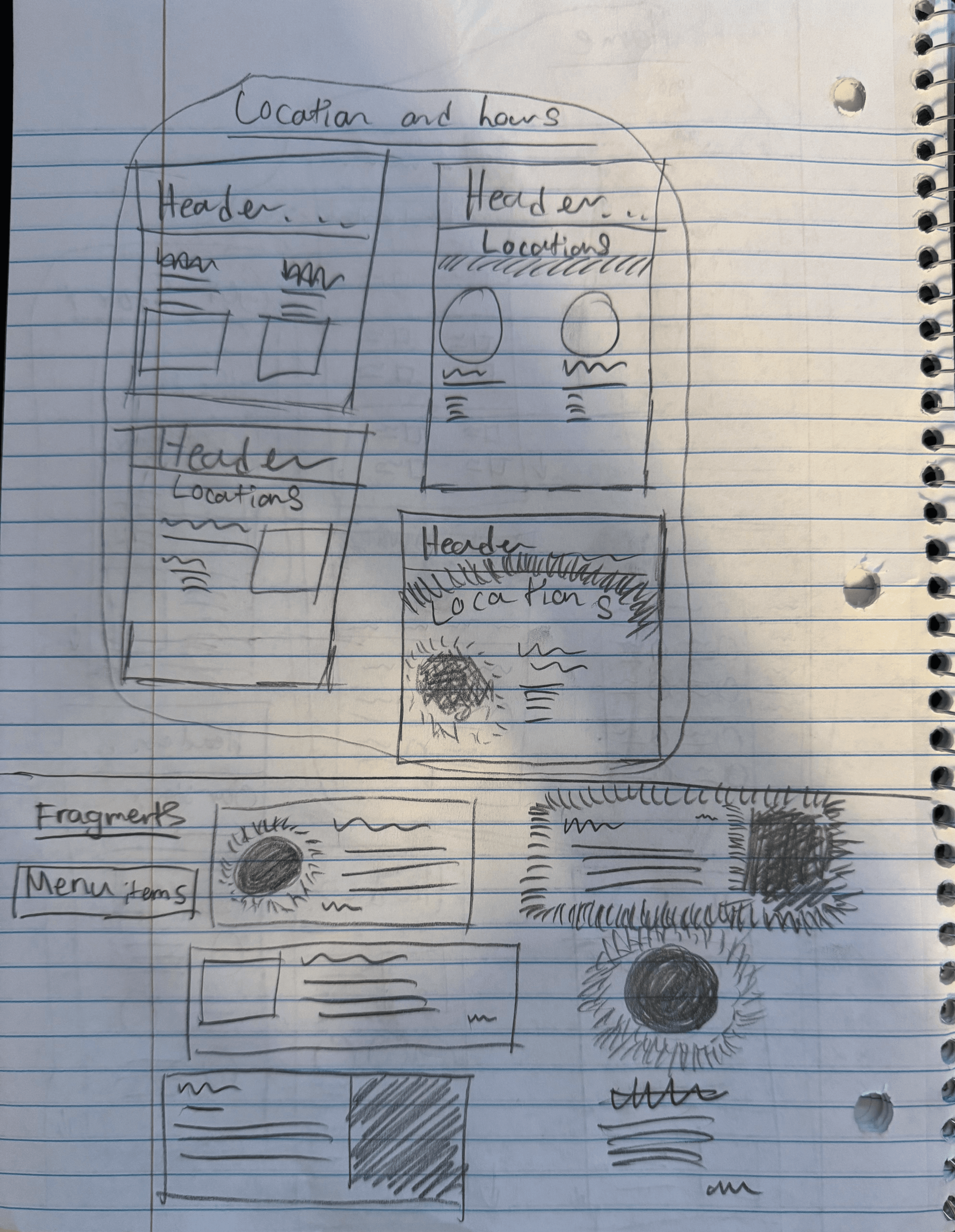
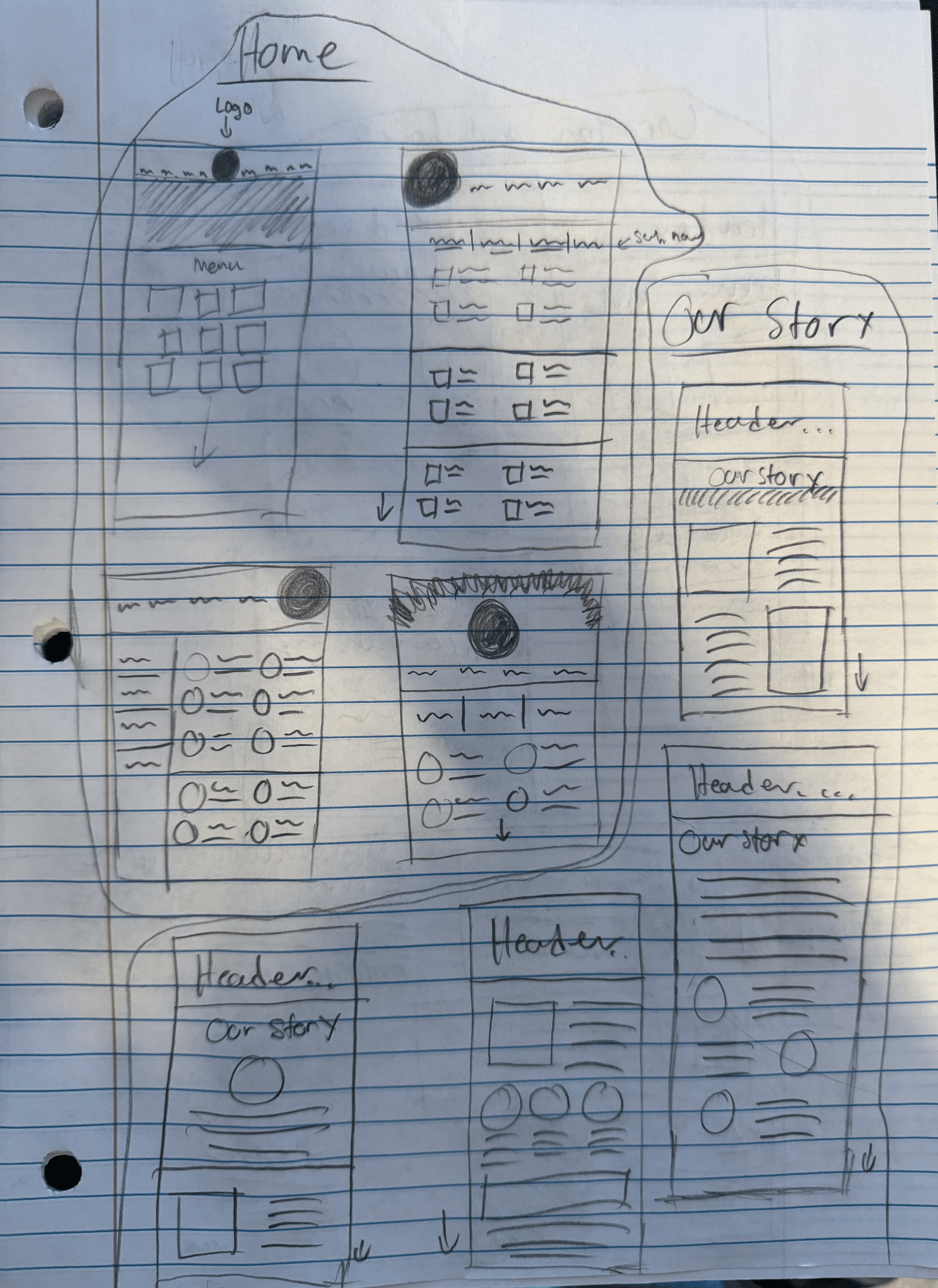
Stage 2 - Sketches
In stage 2, I focused on sketching out our ideas created based on the task list and personas. Along with how the overall websites look structurally, I did several fragments to understand how I would lay out the menu page and how those components could be used on other areas of the website.
Stage 3 - Wireframe and Rough Comps
This is where I transitioned to working in XD. Here I did a wireframe and potential fragments. Notice which ones are used in the final composition.


After laying out the general idea of what I wanted this website to look like, I then did a rough composition. Here I included colors that were used in the fragments.

Final
After a peer critique session where we showed each other rough compositions, I refined my idea to be less robotic and more fun.


Reflection
This project was both very challenging and very fun. I had a great time thinking about what this ramen shop would look like. I also enjoyed creating a bright and fun aesthetic by using typography, playful lines, and color. Looking back on the project, I think I could have done a better job with white space. There are some sections where a graphic feels lonely and others that feel too crowded. I also feel like I could do a better job creating a background for the website. Solid colors aren’t bad, but they don't give it a professional feel.