Overview
This is my first project in interactive design, aimed at introducing website design. We selected one website for redesign and went through a thorough redesign process.
Stage 1 - Sketches
In the beginning, we started by sketching out what we wanted the redesign to look like. This was one of the hardest parts for me because I couldn't get past the design that was already chosen for the NFL. Shown below is the evolution of those sketches.


Stage 2 - More Sketches and Adobe XD
In this stage, we continued sketching while doing group critiques. We also started working in XD. This was my first time using XD, although I already had multiple years of using other 2D designing software like Figma.
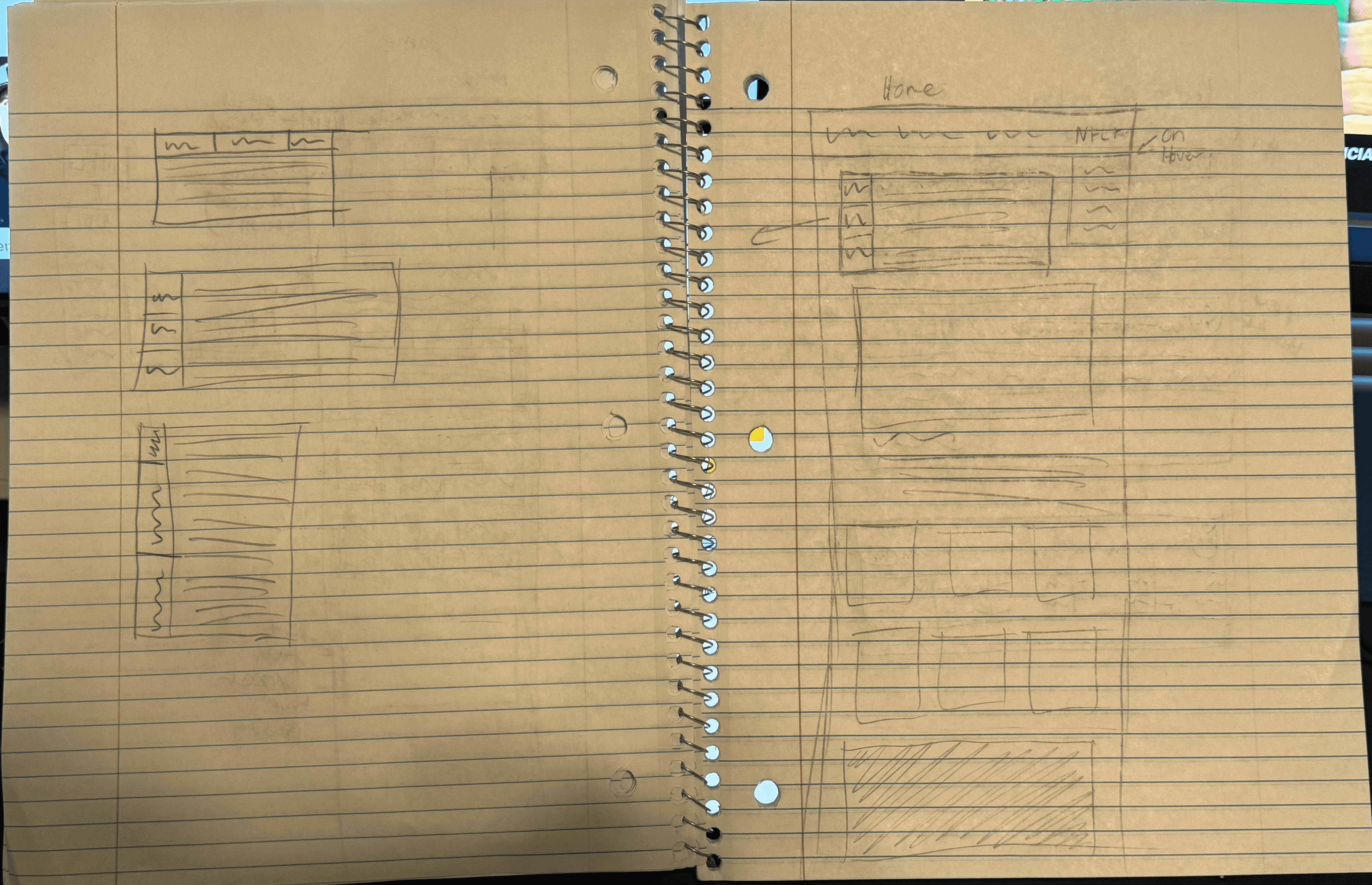
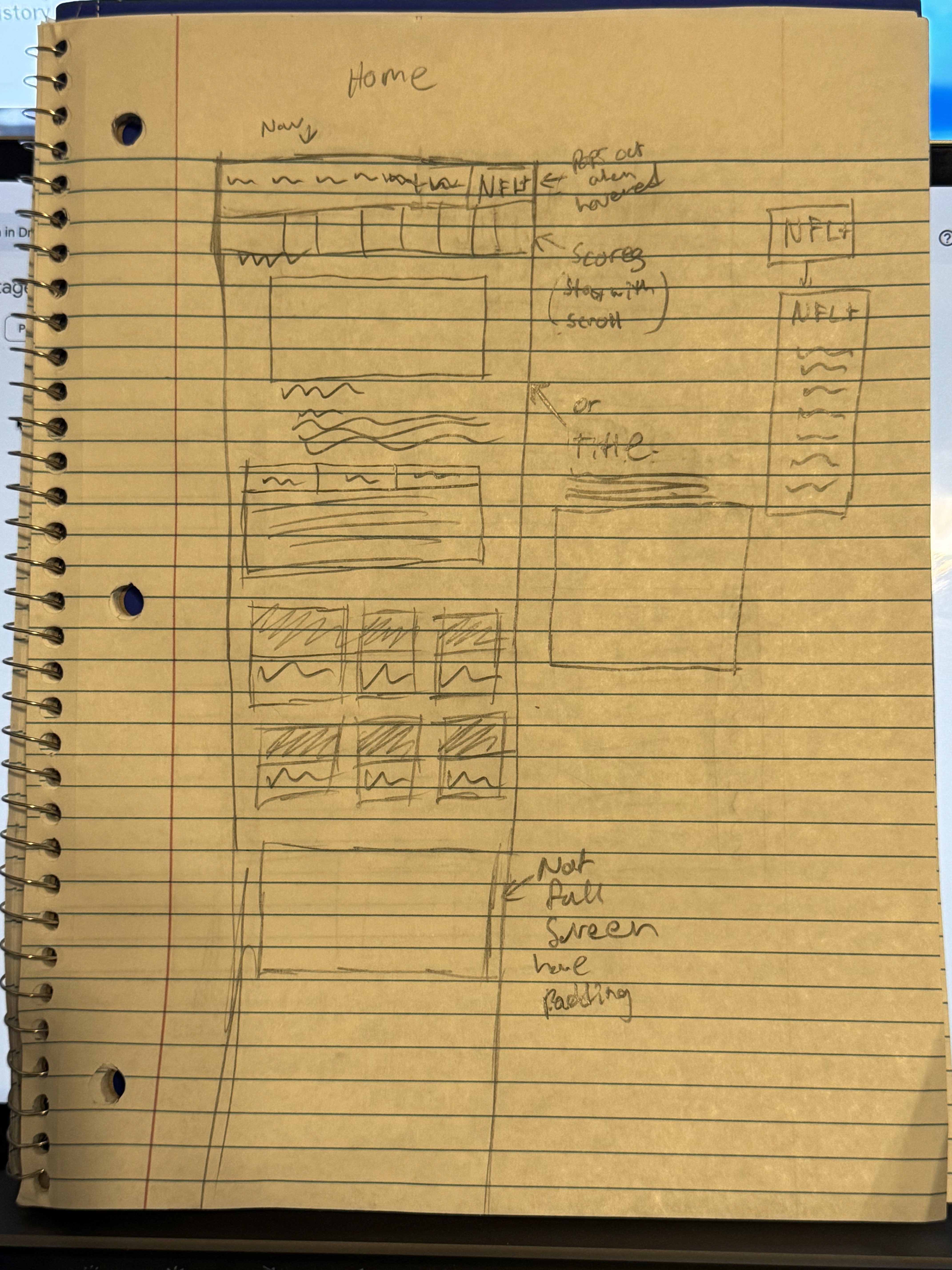
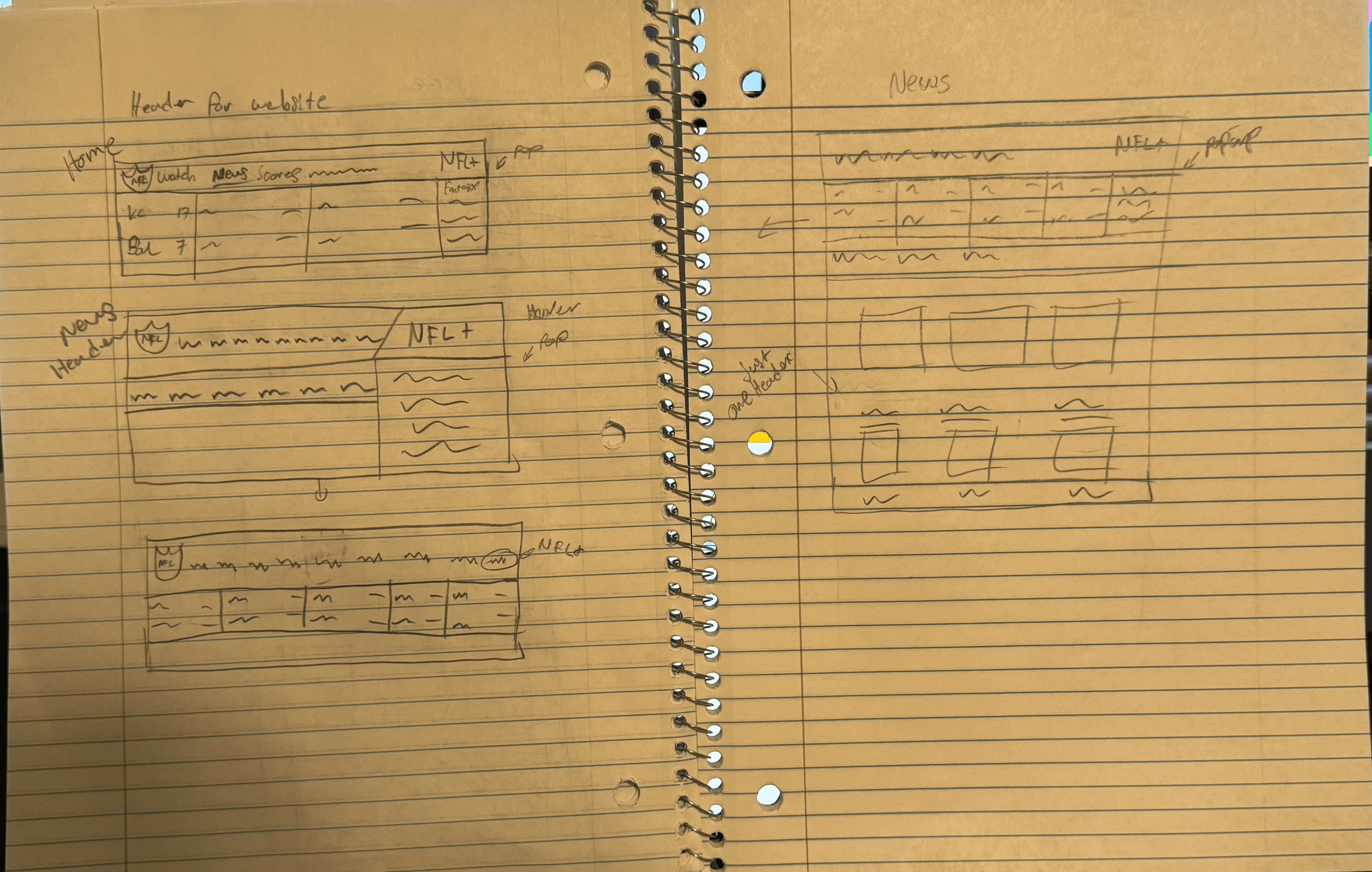
In addition to making more sketches, we started our XD road by making very low-fidelity mockups of the website. No style, only content. This was to get an idea of what was actually on the website and how much we needed to fit into our redesign.


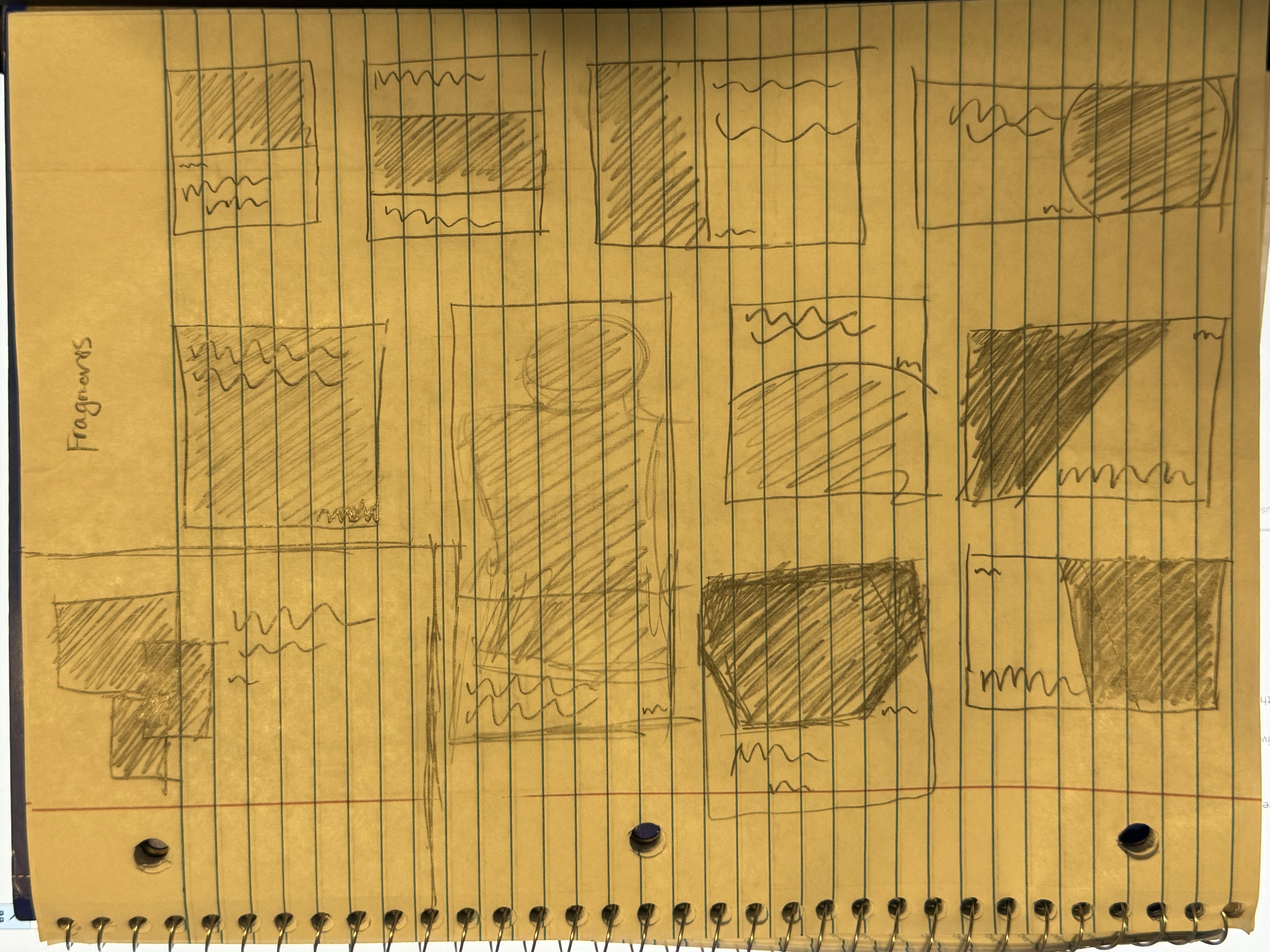
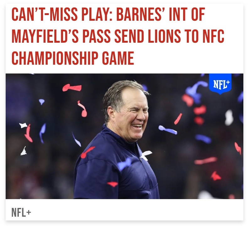
Below are some of the fragments I was experimenting with during the early stages of the design. Notice which parts are used in the final design.


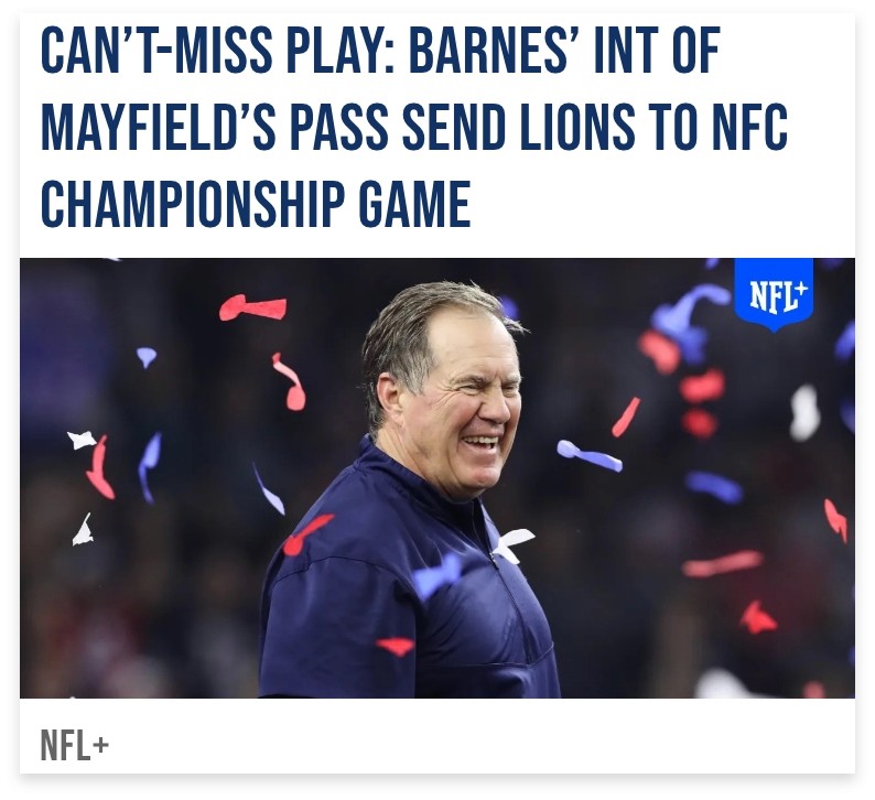
Rough Composition

Final Design
This project was really hard for me. I spent a lot of time in my professor's office getting advice for what I dubbed “being more creative.” What I really struggled with was being silly with my designs and rapidly making different versions. So instead of focusing on making the perfect version, I can put that brainpower into making a lot of versions and select the parts I liked. This ultimately helped me with the slanted look I went for at the end.


Reflection
In hindsight, I could have done more with the slanted motif. I should have included it within the article fragments. I also learned a ton about making things for a screen. Simple but very important things like making type bigger to account for small screens, as well as how repetitive websites are. The fragments exercise was an effective way to help us break down a large website into its smaller components.