Overview
This will show a series of case studies that will go into depth on the modifications made to components in a Figma UI Kit I was working on in a Summer apprenticeship. Some are slight changes to the workflow of the designers, while others add more flexibility to how a designer intuitively creates. I interviewed designers who used this UI Kit about each component I worked on for all these changes to guarantee that what I was changing would be used. I also had access to the Code Repository of these components to see what the developers used.
Text Area
Here is a before and after screenshot of what the old component looked like and what the new variants I created look like.
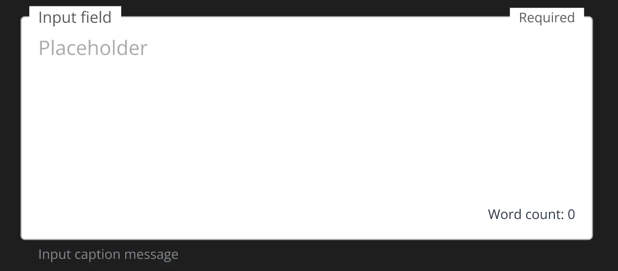

Initially, the designers had to change the states of this Text Area component by hand. To know what they looked like, they used screenshots of what these states were. To alter them, they recreated them each time, copied and pasted where it was used before, or created their component.
I created these component variants that could bend to the designer's needs.
Text Input
This process was similar to the Text Area component, although there was more to go off of since this component was used more than the last.
Here is a before and after of the Test Input component.


And here is a short gif of me walking through the variants.
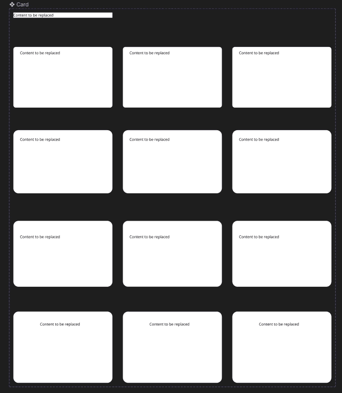
Slot Component
This component was entirely new to me when I was tasked with making it. It was a concept used in the code repository that acted like a placeholder, and when the content of your component was put in there, it would take the place of the slot. My supervisor tasked me with making this within Figma, specifically for the card component. I did this task for both web and mobile.
Here is what the card components looked like in Figma before I changed them to contain slot components.
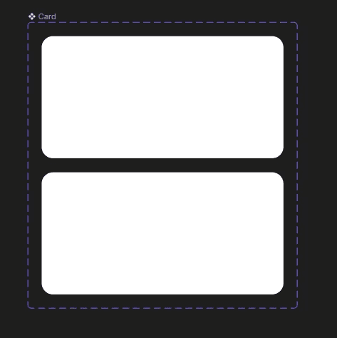


To create the slot component that would live inside the card, I made a frame with the same constraints as the card's contents. Then, to replace the slot with the content you wanted, you had to make your design a component and do an instance swap to put it into the card.
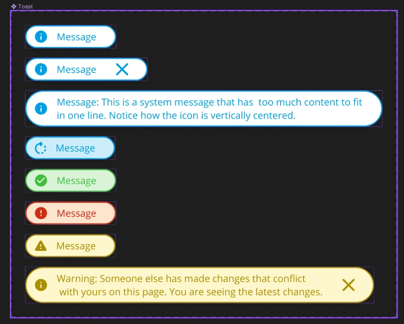
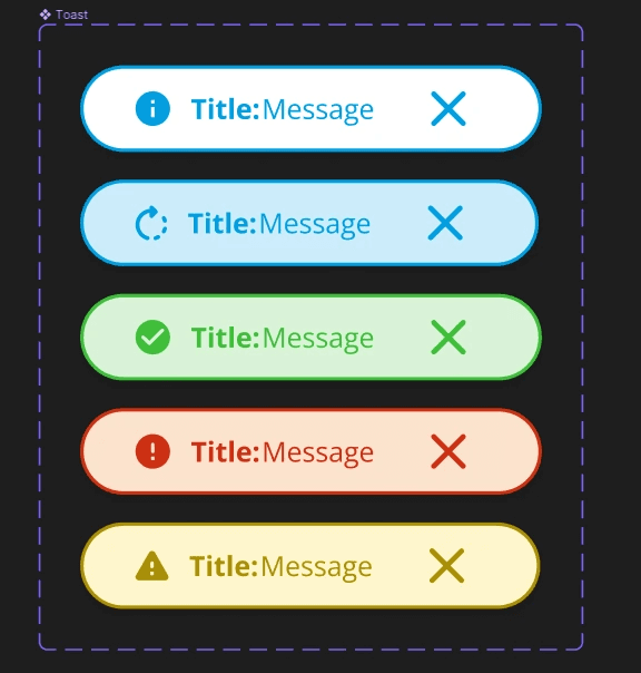
Toast Component
This component was overhauled due to a big Figma update released while I was in the apprenticeship. ConFig 2023 happened live while I was at work, and my supervisor blocked out the whole day for our team to watch the keynote and other speakers. One of the features released was for giving frames Max and Min sizes.
Initially, the Toast component had eight variations, two for multi-lined displays. However, I could replicate the developers' constraints in the code repository with Figma's new Min and Max widths and heights. Here are the before and after results.
Progress Bar
This component was in the design system but wasn't officially in the UI Kit. Versions were floating around the designers within their own Figma files, where they used it when needed, but nothing in the main File where all the components lived. So, I took it upon myself to make it happen. I first referenced the main version used by one of the designers who drafted a progress bar but didn't have time to flesh it out and put it into the UI kit. It had some clever masking to manipulate the bar inside the component (see video below), but no precise spacing or properties to help designers use it efficiently.
My main challenge was creating a component that could build upon itself while not restricting the designers on how to use it. I referenced many other design systems to see how they achieved this balance of freedom and structure and landed on the Carbon Design system. Conveniently enough, they had their Figma link available for reference. They built their “progress indicator” by breaking it down modularly. This idea of modular components led me to design the progress bar for DIG.
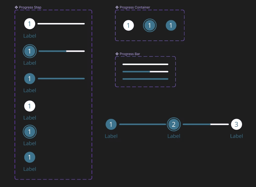
Using the spacing in the code repository and the guideline snapping in Figma, I could make a component that snaps to itself and seamlessly looks like one component. Add some variants, and you can make a progress bar that can be customizable to any length.
I even created a version that also worked with their mobile UI Kit. Notice that this version doesn’t have labels under each step.
